
How to move nav-menu dropdown image from left to right side?
-
Hello,
I’ve just spent a long time trying to work this one out and since I’m still clueless I thought I’d make a post here in case someone can please help me.
Basically when you have multiple pages and sub-pages… the initial top navigation menu will have a little drop-down arrow to the left of each Menu that has sub-pages. What I would like to do is move this image from the left side to the right side of the menu name. However I cannot seem to find anyway to do this.
I’ve found the CSS code in styles.css that controls this image and the code is:
#header-menu > li.menu-item-ancestor > a {

background: url(images/sprite_master.png) -877px -236px no-repeat transparent;

padding-left: 26px;

}
however I can’t find anyway to modify this to move the image to the right. I’ve tried different padding widths, sides, normal widths, etc. and none of these seem to move the image over to the right hand side of the menu name.
Now I could just delete this CSS code instead of trying to modify it and then manually modify the PHP files to show an
on the right side of the menu items with sub-pages. However after looking through the PHP files I can’t seem to find which file creates these links either so I’m now stuck and unable to accomplish this either way.
So I was just wondering if anyone might know how I could accomplish this… either by editing the existing CSS code or by removing it and manually editing the PHP files instead???
Thanks in advance for any advice you can give me.
Mod
Dalin,
This is very difficult to do, because the image is part of the
<li>tag which generates the menu item. Thepadding-leftthat you see above keeps the text from overlapping the image. Take a look at this page for more info. You might want to play around with this advice and see if anything there works for you.I strongly advise against modifying the theme’s files because any changes you make will be lost in the next update. See this page in the theme’s wiki: http://wiki.khairul-syahir.com/graphene-theme/wiki/Customisation_using_a_child_theme
Don’t forget to put code between backticks.
Welcome aboard,
Ken
Hey Kenneth,
Thank you for all the advice. Good point about not modifying the theme’s files and as a result I’m now trying to do this all through custom CSS in the Theme Options. I’ve just been reading through those links you gave me and they were very helpful. Thanks to them, I think I’ve almost solved this. There is just one more little issue with it which I was hoping you might be able to please help me figure out.
What I’ve done so far that eventually worked turned out to be a few simple CSS changes. All I had to do was:
1) Modify the background position on both the li menu and the li hover menu to right-aligned
2) Change the padding-left to a smaller number so there wouldn’t be a big gap on the left where the arrow used to be
3) Finally to add some padding-right so the arrow didn’t overlap the text on the right
In my case the final custom CSS in Theme Options now looks like this:
#header-menu > li.menu-item-ancestor > a {

background: url(images/sprite_master.png) right -236px no-repeat transparent;

padding-left: 10px;

padding-right: 20px;

}


#header-menu > li.menu-item-ancestor:hover > a,

#header-menu > li.current-menu-item > a,

#header-menu > li.current-menu-ancestor > a {

background-position: right -192px;

}
And for the most part this works perfect. The only remaining issue is that now I’ve moved the arrow to the right, for whatever strange reason, it now picks up a 2nd arrow in the middle. I’ve tried posting an image below so you can see what I mean:
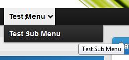
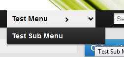
Furthermore if I modify the custom CSS and add width=150px to move the arrows further to the right you can now clearly see what’s happening as in this image:
So I have no idea why right-aligning an image would all of a sudden make it pick up 2 arrows. However I’m now stuck again and cannot seem to find anyway to remove this middle arrow. Do you have any ideas?
To be honest, I have not probed too deeply into the navigation CSS. It underwent a major reworking in version 1.4 and I simply haven’t had the time to figure it out yet. (Which I need to do because there are some issues with on two of my sites.)
You are making good progress, just keep plugging away and remember that GIYF.
Hey Kenneth that’s okay. I’ve just spent some more time on it and I think I’ve finally come to the conclusion that this isn’t possible through CSS alone.
The reason is that the arrows are selected from the images/sprite_master.png file which contains all the main images for the theme. If you have a look at this image you will see the white down/right arrows and the black down/right arrows are on the same row quite close to each other. Due to how CSS works it seems impossible to select the black or white down arrow without including the black or white right arrow near it.
This explains why in my images above I was getting 2 arrows by right-aligning the down-arrow image. Because the width of my menu boxes is wider then the width between the down arrow and the right arrow in sprite_master.png. As a result when the background is generated, it fills the width of the menu box from the far right of the image to the left for however many px the menu box is and so picks up the right arrow along the way.
On the other hand the sub-menu right arrows don’t have this problem because their x starts far on the left hand side of the right arrow where it’s just transparent. And then the sub-menu box is just big enough for this so once the right-arrow is shown there isn’t anymore background (which means we don’t see the down arrow further to the right in sprite_master.png).
The problem is that the CSS Background Image position property seems to be the same for both the location of the background and where it finds it in the sprite_master.png file. There is no separate setting for these 2. As a result when you align the down arrow to the right you get the extra width filled with the 2nd arrow that is too close.
If you increase the x position to reduce the horizontal width (thereby hiding the right arrow) you can do this but then the background image becomes to small and no longer goes all the way across so you end up with the down arrow overlapping the text and padding won’t fix it either. If you make the x position smaller to increase the horizontal width so the down arrow ends up on the right again, you also end up with the right arrow visible again.
So due to how CSS works and the fact that both down/left arrows are on the same row close to each other I don’t think there’s anyway to accomplish this just through CSS.
Instead the workaround I found (which works) is to simply edit the sprite_master.png file and drag both white & black down arrows further down the y-axis so they have lots of transparent space to the left of them. This way when you align them to the right as my CSS code in my previous post did… there is more then enough transparent space to the left that exceeds the width of the menu box and therefore doesn’t show any other images as well. Then I just update the above CSS code with the new y values for the black & white down arrows.
The only downside to this is, as you mentioned, if the theme gets updated and this sprite_master.png gets edited then I’ll have to re-edit the image and adjust my x,y positions in the CSS code again. However for the sake of 2 arrows this didn’t take very long now that I know what to do.
So finally I can mark this solved. Thanks again for your help and you sure pointed me in the right direction 😀 Maybe not the most efficient workaround but as this seems impossible via CSS alone this was the next best way I could think of.
The only other thing I can add… is it possible to make a suggestion about this to the themes creator and ask if in a future version he can modify the sprite_master.png file to have each arrow on its own line with ample transparent space around it so people like me can easily change a few lines of CSS code and have the arrows on whatever side we want??? Seems like it would be a rather quick fix to me and would make things so much easier.
Hi, well done on finding a solution. I have a suggestion to allow the theme to be updated without overwriting your changes. Create your own images for the arrows (perhaps even a child-sprite-master) rather than editing the main sprite master and then refer to that in your child theme css, that way it will not be overwritten by an update.
Hope this helps
Jon
Hey Jon that’s a brilliant idea! I just did that and it works perfect. The original sprite_master.png is now back in the graphene images folder and my modified sprite master is in my graphene child images folder. So now 99% of the theme uses the normal image and just these 2 arrows use the custom one.
Great thinking there. I’ve only just realised the power of the using child themes. Thanks to child themes, I’ve now also made a php css file as well so I can update a few variables at the top and automatically have the various colour schemes (nav bar, background, etc.) updated automatically. Thanks for the tip it’s made things so much easier with many things not just the sprite image.
Viewing 7 posts - 1 through 7 (of 7 total)
- You must be logged in to reply to this topic.
