
Home › Forums › Graphene Mobile Neo › Support
Graphene Neo Menus
-
Hello,
This question is about using menus with Graphene Neo.
I want to remove some, and rearrange other menu items on the mobile menu, without affecting the menus for desktops.
Another way to say this, is that I want to make menu items conditional based on whether the user is on a mobile device or not.
I found this in my settings:
<select> element for menu
Using <select> element for menu allows you to have any number of menu items without crowding the layout.
— Is this the answer to my question? If so, I don’t know how to use <select>. Would someone please explain this in more detail? Where do I insert <select> and what will it do?
Or, if I’m wrong about <select> being the solution, can someone please offer any alternative advice on this subject?
Thanks in advance!
Admin
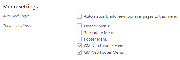
Quote:I want to remove some, and rearrange other menu items on the mobile menu, without affecting the menus for desktops.Go to WP Admin > Appearance > Menus. In the Theme locations list under “Menu Settings”, you will see that there are two menu locations for Neo. Just assign the menu you want to appear only to mobile users to those two menu locations.
Thanks for the answer! Can be marked as [SOLVED] !?
Just to spread the word and with this the Graphene Mobile Theme: The solution in German language ;)!
Individuelles, angepasstes Menü für das Graphene Mobile Theme:
Design -> Menüs -> Positionen verwalten. Dort kann das entsprechende Menü ausgewählt oder ein neues Menü erstellt werden.
Again: Thanks to the developers!
Glad to help. Thanks!
Viewing 4 posts - 1 through 4 (of 4 total)
- You must be logged in to reply to this topic.
